When it comes to building a memorable brand, consistency is everything.
Just look at the world’s most recognizable companies and how fast you recognize them. A glimpse of the swoosh and you know it’s Nike. The golden arches represent McDonald’s. The same goes for Apple’s half-munched apple.
These companies are practically glued inside your brain, and strong brand guidelines are part of the glue that makes them stick.
But brand guidelines go far beyond a logo or icon. It’s in their colors, imagery, fonts, tone, and even the feeling you get when you see one of their ads.
In this article, we’re going to look closer at what brand guidelines are, 15 examples from companies that nailed it, and some tips for how to create brand guidelines of your own.
Let’s get to it.

Start selling online now with Shopify


What are brand guidelines?
Brand guidelines, also called a brand style guide, are essentially an instruction manual and rule book on how to communicate your brand.
They lay out all the visual details, as well as important notes about the company’s voice, tone, and messaging. They come in the form of a physical or digital booklet filled with examples of what to do and what not to do.
Brand guidelines comprehensively cover a company’s brand identity, including its:
- Logos: full logos, secondary logos, and icons
- Color palette: primary and secondary colors
- Typography: font styles, sizes, and spacing
- Other imagery: photos, illustrations, and artwork
- Voice and tone: how the brand uses language and emotion
When companies take the time to create brand guidelines, it helps to ensure that their brand image stays consistent no matter where it shows up.
This will pay off big time in the long run, as your company will generate the familiarity and reliability that open the doors to brand loyalty.
Next up, let’s explore 14 awesome brand guideline examples you can use as inspiration.
14 companies with killer brand guidelines
1. Asana

While some logos and brand images might seem random, savvy companies create them with a specific strategy and meaning. Asana helps people understand the “why” behind its branding by explaining its choices, including the logo’s three dots.
These dots highlight the limitless potential of human collaboration, and the company hopes that they communicate a sense of clarity, balance, and purpose-driven design.
Micah Daigle, who co-led a rebrand for the SaaS company, even published a brand book about the origin and thought process behind Asana’s rebranding.
2. Slack
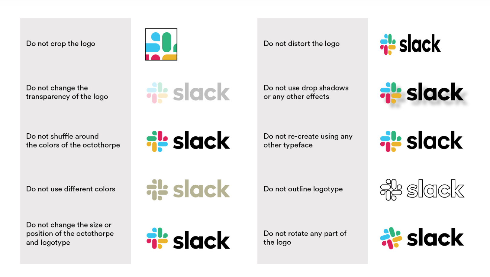
Nested under its media kit, brand guidelines from Slack cover everything from branded themes to governance considerations.
The material manages to be informative without overwhelming readers by implementing a healthy amount of whitespace and graphics. Bright colors and bold, clean lines are an excellent representation of the Slack brand.
The key here is the comparative lists. Slack simplifies the concept of its brand by displaying improper use cases alongside acceptable occurrences. You can see this clearly in how its logo is compared and contrasted. Its brand voice also gets a similar treatment.
3. Nusr-Et
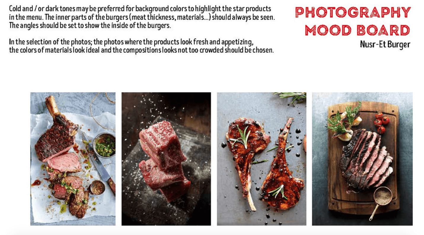
For food companies, photography can be make or break. That’s why Nusr-Et included product photography in its brand guidelines.
It uses cold and dark backgrounds to make sure the food is the star of the show. Especially in meat photos, the texture and thickness should be easily seen so viewers can immediately tell that it’s high-quality stuff.
These photos set a clear mood and tone for the company’s branding: the minimalist backgrounds and attention to detail show sophistication and dedication to its craft.
You can learn more about Nusr-Et’s brand formation through its brand book. If you’re thinking of starting a restaurant, you can even use it as a brand guidelines template for your own business.
4. Wolf Circus
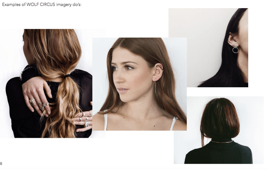
Ecommerce company Wolf Circus’ brand guidelines cover everything from the brand’s “why” to its typeface system.
Going through its brand style guide, you can see how certain colors are key indicators of Wolf Circus brand design. Blue-gray, pastel pink, and nude act as supporting colors that can be used for various design elements and backgrounds.
Its grand guidelines also show how the brand wants to display its promotional content.
For example, Wolf Circus wants advertisements for its product to emphasize minimalism and make the jewelry the center of attention.
5. Urban Outfitters

Urban Outfitters, a lifestyle retailer, is all about edgy designs and quirky product shots in its visually creative style guide.
The retailer’s brand guidelines include its photography methodology and a good deal of information about its logo and brand face.
As Urban Outfitters believes in evolving with consumers’ changing preferences, the retailer doesn’t shy away from rebranding itself every six months or so.
Everything from the logo to the store environment is refreshed to appeal to modern consumers, making Urban Outfitters one of the best brand guidelines examples to follow if you’re interested in staying hip and relevant.
6. Google Marketing Platform

Sometimes it’s necessary to merge two products into a single brand.
On July 24, 2018, Google launched its Google Marketing Platform—a collaborative brand that unified its DoubleClick advertiser products and the Google Analytics 360 Suite.
This new brand focuses on being trustworthy, professional, and insightful, while still maintaining that feeling of approachability that Google customers have come to love.
Its visual guide blends simplicity and powerful visual elements to showcase its brand in a way that’s easy to understand.
7. Uber
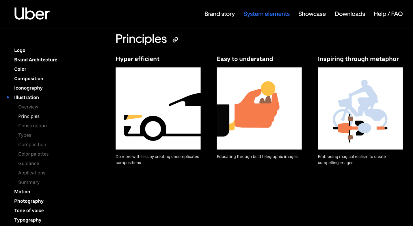
Ride-hailing app Uber communicates its brand to the general public via nine core elements:
- Logo
- Color
- Composition
- Iconography
- Illustration
- Motion
- Photography
- Tone of voice
- Typography
The company’s brand page provides an overview of each of these elements, along with best-in-class examples for quick insights.
An overview of the Illustration section, for example, shows that the company uses limited color, clean lines, negative space, and basic geometric shapes to give its illustrations a branded feel.
8. Alienware
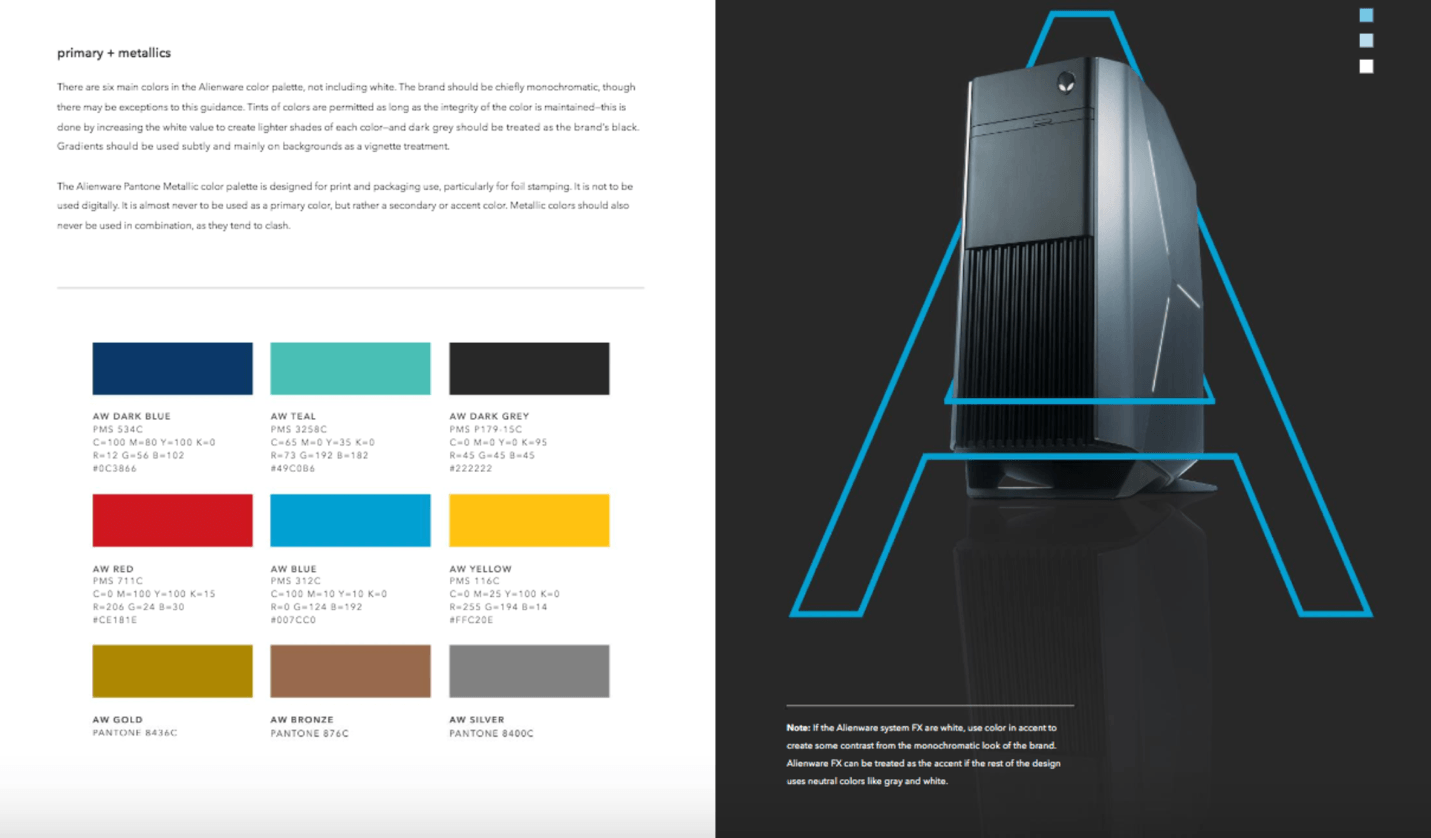
In its younger days, Alienware was branded as a company that catered to “serious gamers.”
But after doing more market research to better understand its audience, the company realized that serious gamers view gaming as a lifestyle choice—one with a diverse, ever-expanding culture.
So the company revamped, using its brand guidelines to show that its new identity is a closer reflection of the gaming community’s identity.
Everything from illustrations and logo to layouts and photography is also clearly defined for anyone looking to promote or sell the company’s products through its own campaigns.
9. Audi
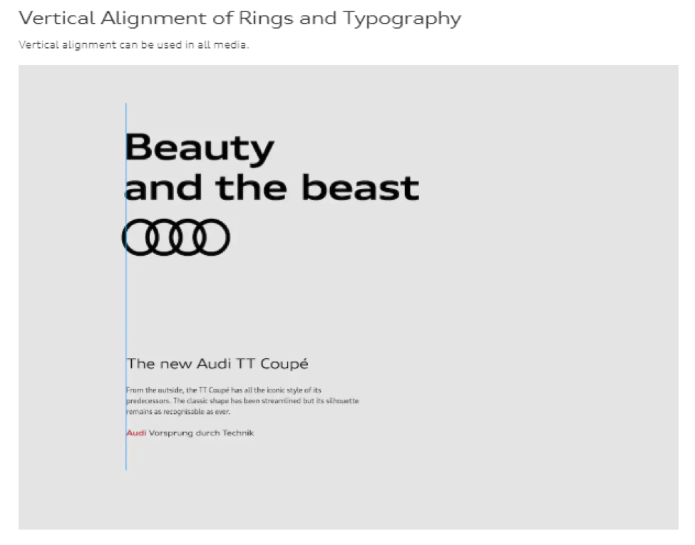
Audi is a household name worldwide, meaning the brand is replicated and promoted in thousands of places.
That’s why the company’s online brand guidelines are very specific.
Audi uses different guidelines for its brand appearance in user interfaces, communication media, corporate branding, corporate sounds, motion pictures, motorsports, and dealer facilities.
Even ratios and alignment rules exist for using the company logo in any branding material.
10. Carrefour
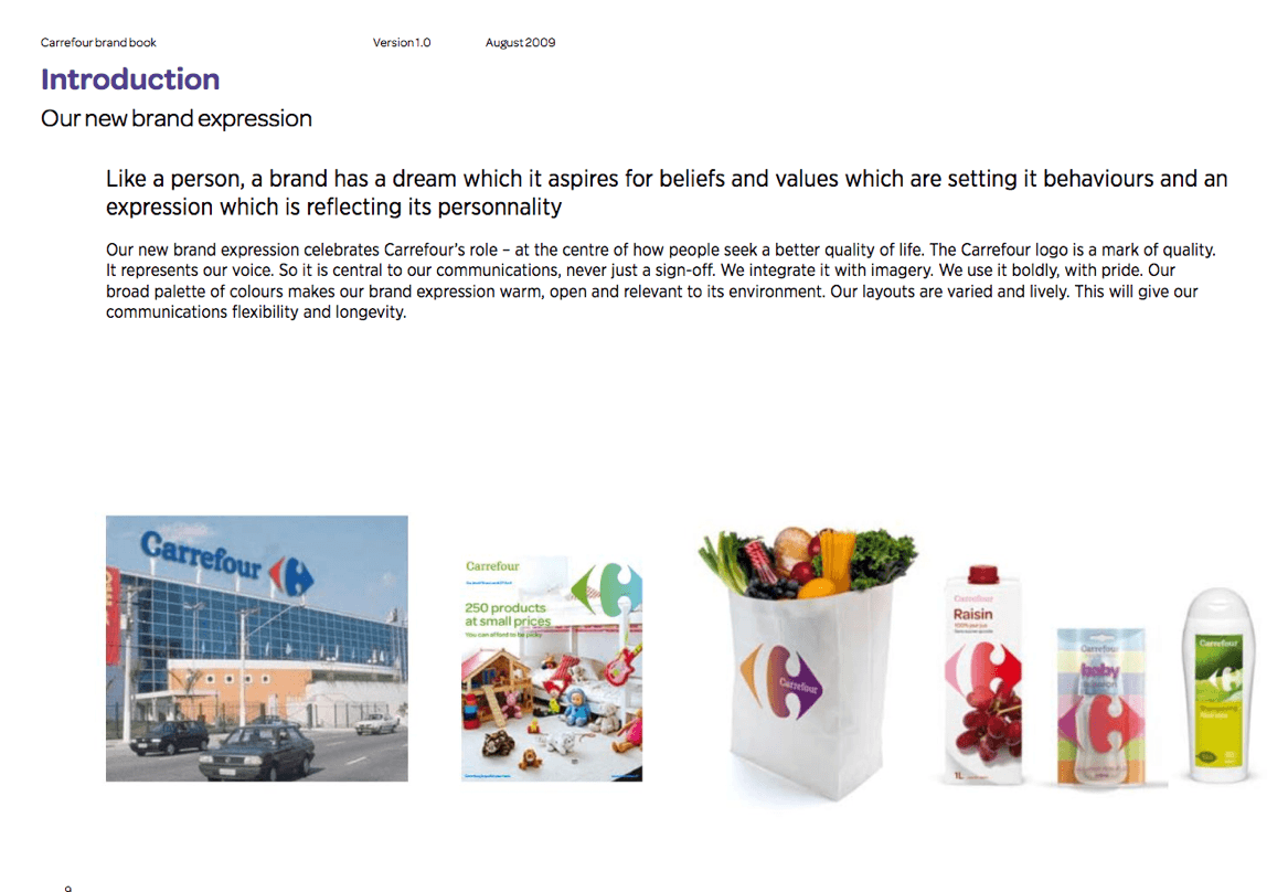
A broad color palette and lively layouts complement the rich, colorful history of the Carrefour brand.
Its brand guidelines content focuses on being warm, open, and connected to its brand’s environment. Because Carrefour is in the retail food industry, this is an excellent approach to take in its goal of becoming recognized and respected for its dedication to customer service.
If you’re building a welcoming “family brand” that aims to instill a sense of familiarity and warmth, Carrefour’s brand book might have some great inspiration.
11. Shazam
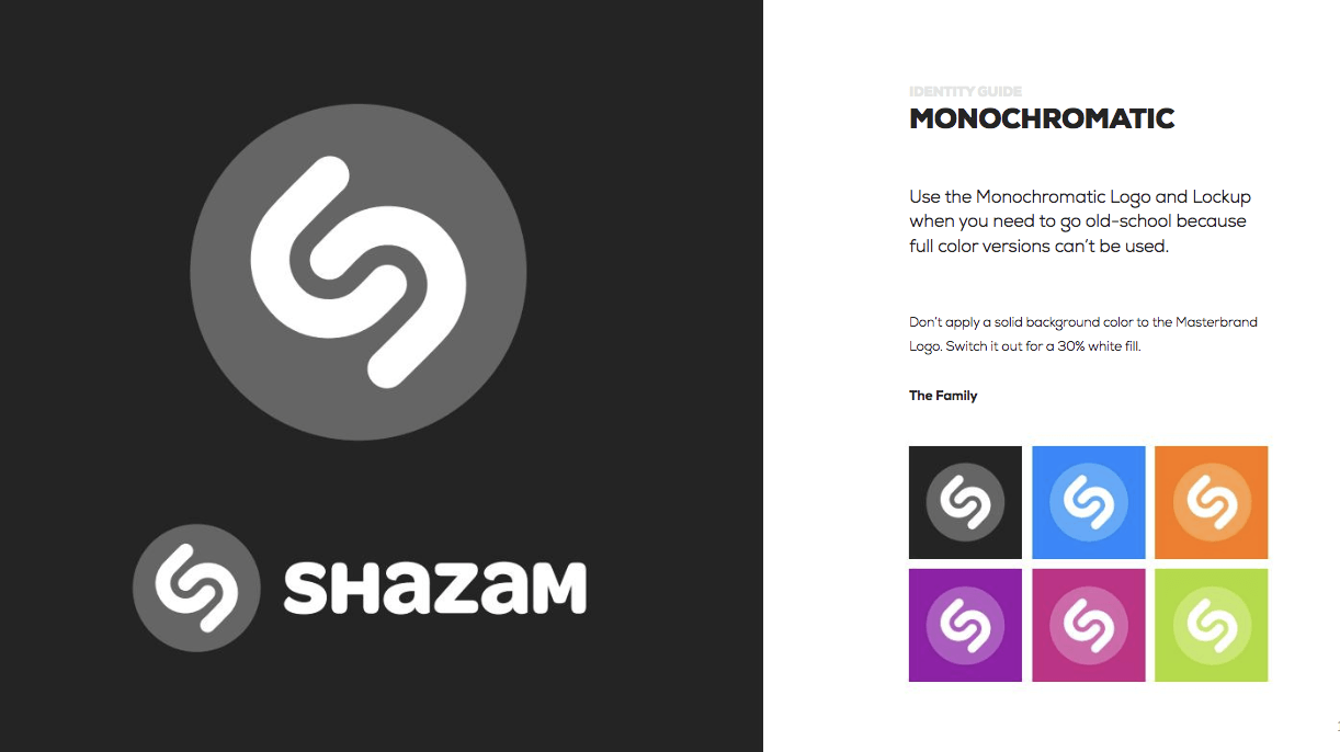
This Apple-owned app makes it easy to identify songs you hear in restaurants, shops, and pretty much anywhere else.
The company implements the same straightforward approach in its brand identity guidelines as it does in its user interface. It explains the important role its logo plays in identifying its brand and how to combine the logo with the watermark in different contexts.
Shazam also incorporates a little humor in its identity guide to keep things fun and interesting while driving home the brand’s personality.
12. Netflix
More than 20 years after it was born, Netflix continues to grow in popularity as a cornerstone of the on-demand media market.
Naturally, the company’s logo and “N” icon have practically grown into entities of their own.
Because its brand is mostly recognized by this, it doesn’t concentrate on too much in its online brand guidelines except for the logo and symbol.
This shows that your brand guidelines only need to go as far as the scope of your brand.
Sometimes, the basics are all you need to effectively keep things in line.
13. Berkshire Hathaway HomeServices
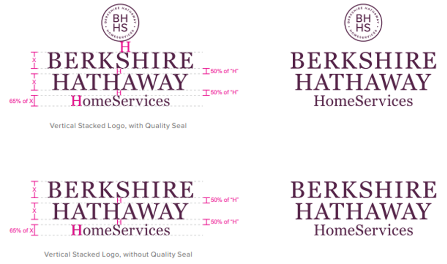
Berkshire Hathaway HomeServices offers a suite of tools to US home buyers, sellers, or luxury real estate investors.
Its brand guide is comprehensive, covering 106 pages of information regarding color palettes, voice, and tone. It also provides pre-set guidelines for physical collateral like yard signage and printed stationery.
The genius of this style guide rests in its thoroughness. Every possible use case is outlined in the document to prevent misrepresentation or miscommunication. This applies to online platforms as well as offline brand interactions.
This is a great reminder that guides should focus on both the physical and digital elements of your brand. The more thorough they are, the more value they provide as you grow.
14. Visa
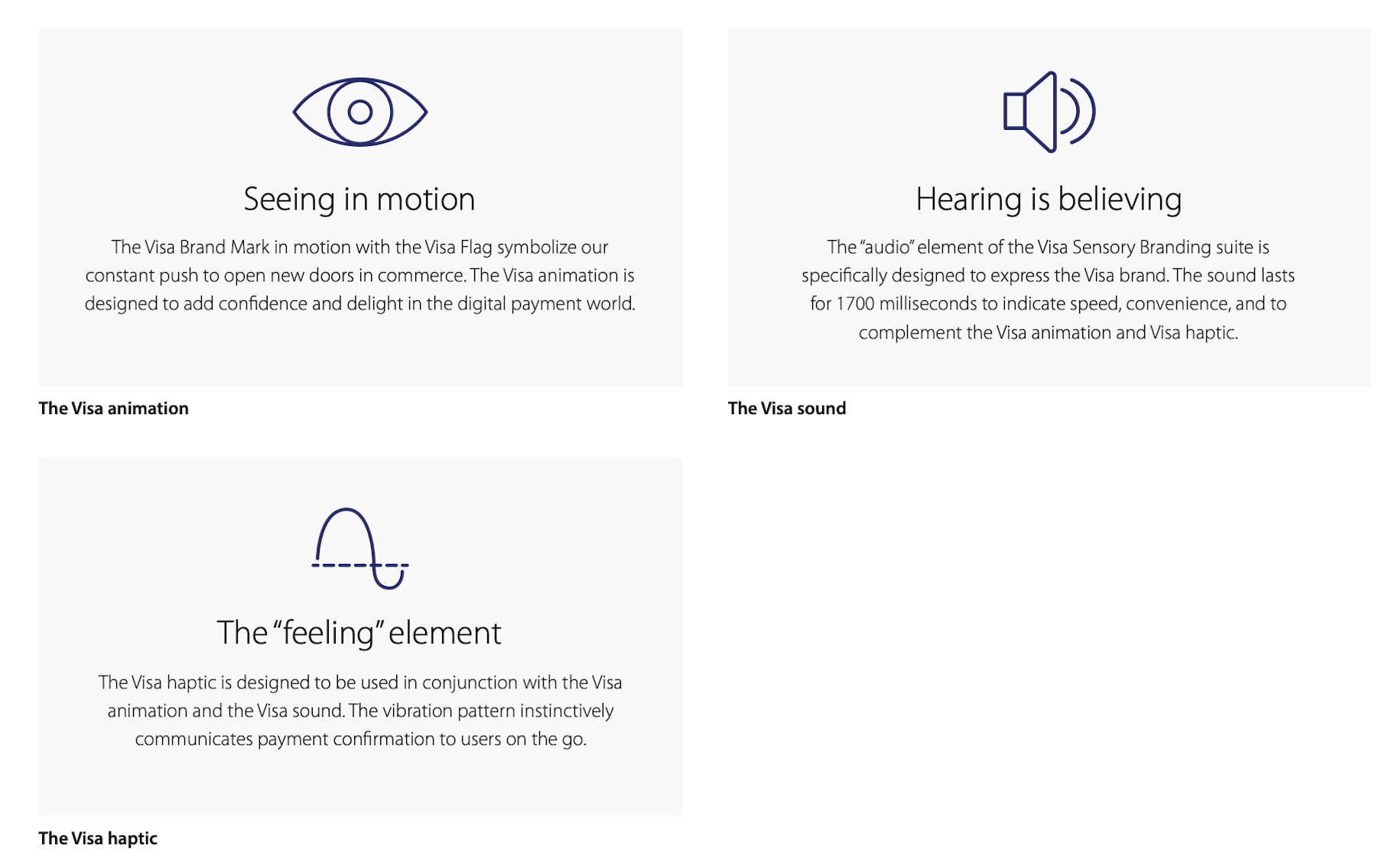
Sweet and simple instructions do a great job representing this global payment brand.
Visa focuses on the effect of UX and online design on its logos and color elements. It self-identifies a digital tone of authentic, iconic, and smart.
An interesting addition to this brand guideline is its sensory elements. Visa goes into detail discussing the sight, sound, and haptics of its brand in an online environment. Because Visa payments can happen on thousands of apps, coherence in physical identity is a must.
Sensory feedback could be important to your brand guidelines if you own an ecommerce or digital-only brand.
Tips on how to create brand guidelines
1. Don't be afraid to get specific
The more details, the better. If you’ve addressed this in your brand strategy, explain specific scenarios and uses for different colors, fonts, and imagery.
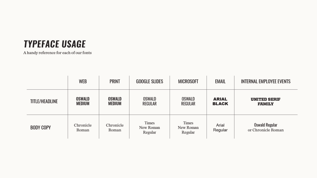
In Element Three’s brand guidelines, the company has an exact font for pretty much every communication channel.
The Typeface Usage section discusses the font name and style for titles and headlines, as well as body copy. These rules apply to multiple channels, including web and print content, emails, and internal employee events.
No room for uncertainty there.
2. Name your primary color
If you want to go a step further in solidifying your brand, name your primary color.
For example, Netflix calls its primary color “Netflix red,” and HubSpot uses “HubSpot orange.” Spotify uses—you guessed it—“Spotify green.”
In doing this, it creates an air of importance around your brand, while claiming the color as your private territory. (Spoiler alert: It’s not private, but it sure looks cool.)
This brand guidelines tip is so simple, it almost feels like cheating.
3. Brand your guidelines
The purpose of brand guidelines is to make sure your brand is always conveyed in the same way—and the document itself is no exception.
Think of it as another marketing material that showcases your brand’s vibe.
You can accomplish this by adding small touches that are in line with the guidelines you’re explaining.
For example, instead of numbering pages with plain black numbers, use your logo icon and color accents to make it your own. Use your brand colors and fonts in section headings, as well as in your explanations and descriptions.
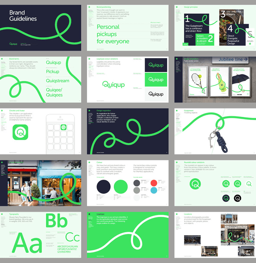
Here’s an older iteration of the Quiqup brand, which used a fun curly Q in its logo and icon. The company extended this looped line throughout the brand guidelines document to create a visual flow while enforcing the visual identity.
4. Get professional help
It would be a bit ironic if your brand guidelines looked like a hack job.
If nobody on your team has graphic design skills, consider hiring a professional to nail down the most important parts of your brand.
For a young business, this might feel like a steep investment, but as you know by now, your brand is a huge deal.
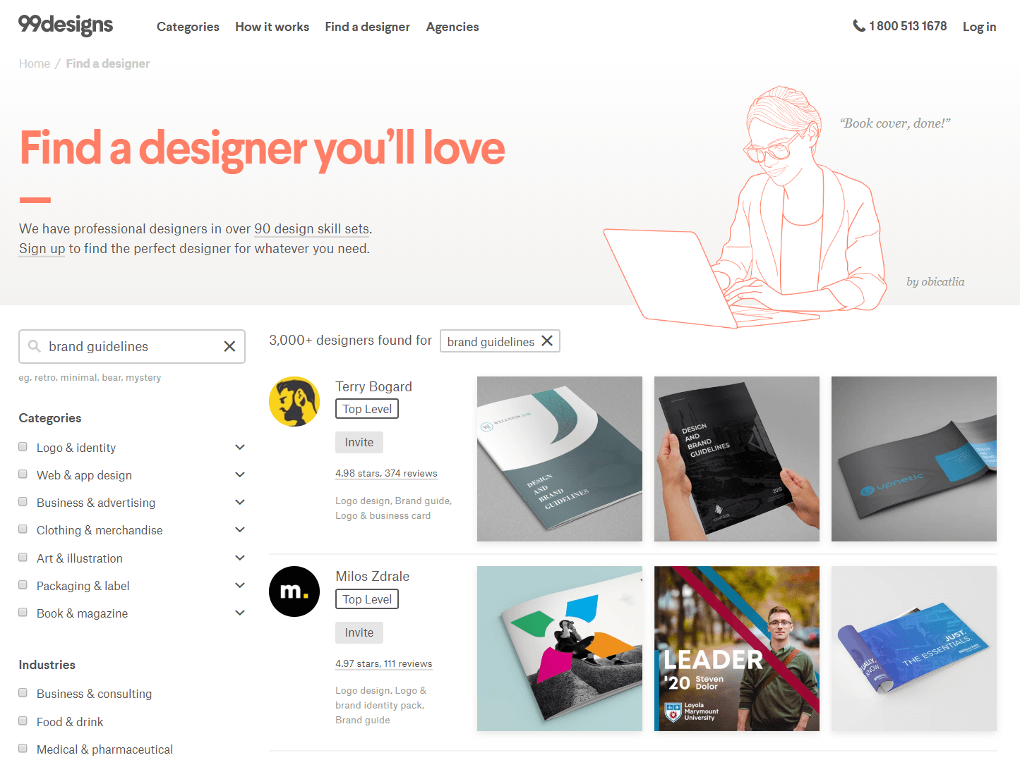
Look for more affordable options on freelance websites like 99designs, Fiverr, and Designhill. Where there’s a search bar, just type “brand guidelines” to see portfolios from available designers.
Make your brand a consistent experience
As we already discussed, consistency is critical if you want your brand to stick in consumers’ minds. Every little detail counts, from your primary color all the way down to the font you use in your company emails.
Brand guidelines are a great tool for laying all of these rules out and ensuring that they’re always followed. Guidelines are especially helpful if you partner with other businesses that will be using your visual brand elements, like in promotions and advertisements.
By proactively making sure that everyone is always on the same page, you’ll have greater control over your brand image.
And as your business grows and matures, this will help to build a trustworthy and reliable experience for everyone who engages with it—which means more customers and more profits.

Start selling online now with Shopify


Want to Learn More?
- How to Brand Your Ecommerce Store
- Logo maker : Generate an amazing logo for your business
- 10 Personal Branding Tips That’ll Elevate Your Business
- How to Create and Execute a Growth Strategy
- How to Create a Content Strategy That Actually Drives Traffic
