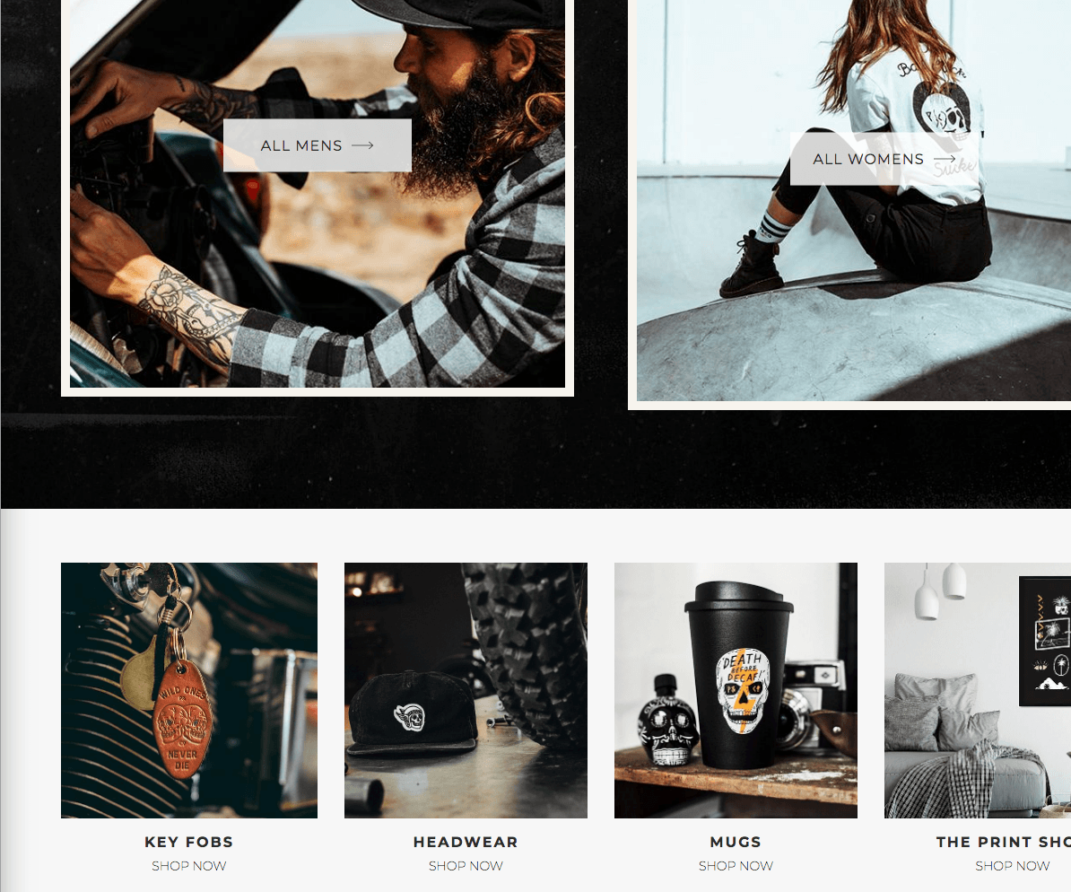
When you’re selling online, you want to make sure that your website represents who you are and what you do. After all, it’s your chance to make an impression on your customers. And if you do it right, you can make a lasting one.
Ready to start your store and make an impression on customers? Find awesome products to stock at Handshake, your one stop wholesale shop.
That’s why, when starting an online business, designing your online store is one of the more important things to get right. There are plenty of other business tips and tricks readily available for you. But, in this article, we’ll go over ecommerce website design.
I found 40 great ecommerce businesses that I thought stood out from the crowd.
What is the Most Important Element of eCommerce Website Design?
You’ll notice that the key for most of these ecommerce website designs shown here is the photography. Photos play an important role in any website that’s trying to sell products online.
You don’t necessarily require fancy gear to take stunning photos. We offer a photography course that centers around taking high-quality images using just a smartphone. It also includes tips on how to edit photos to appear as if they were taken by a professional.
Let’s check out each of these ecommerce website examples, one by one.
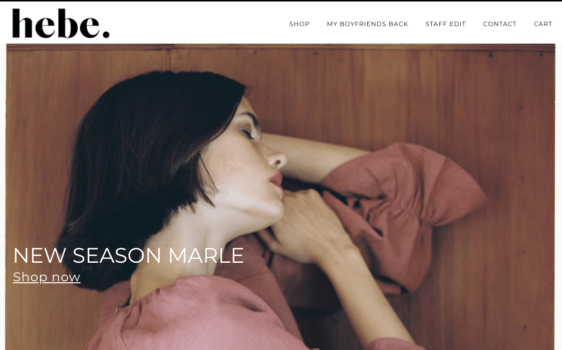
1. hebe
Hebe’s website is beautiful. The thing that stands out the most is photography. High-quality photos are important when running an online ecommerce business, especially if it’s a clothing website. Their typography is great as well. The font is just a little bit thicker than what you usually see online. It makes the website design stand out even further.
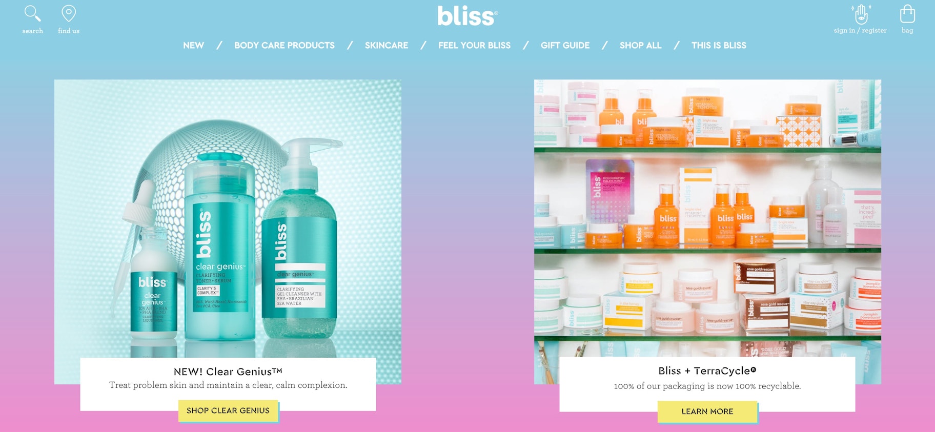
2. Bliss
This ecommerce website is channeling their fun energy through their website design. With bright colors, it gives off a very cheerful feeling. Additionally, they’ve done a great job with the photography. The big photos on their homepage set the feeling of how the rest of the website design looks like.
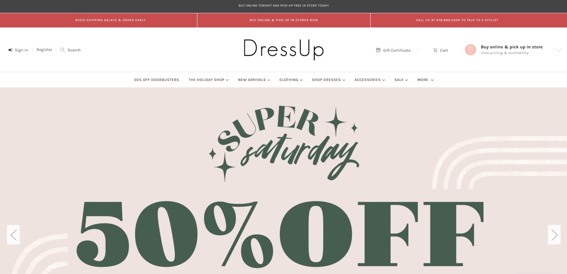
3. Dress Up
Dress Up sells fashionable clothing for women. They use contrasting colors and big, bold texts to highlight new arrivals, sales, or seasonal promotions. What’s interesting on their website is a “Chat with us” option, which isn’t common for fashion online stores, but definitely a plus point!
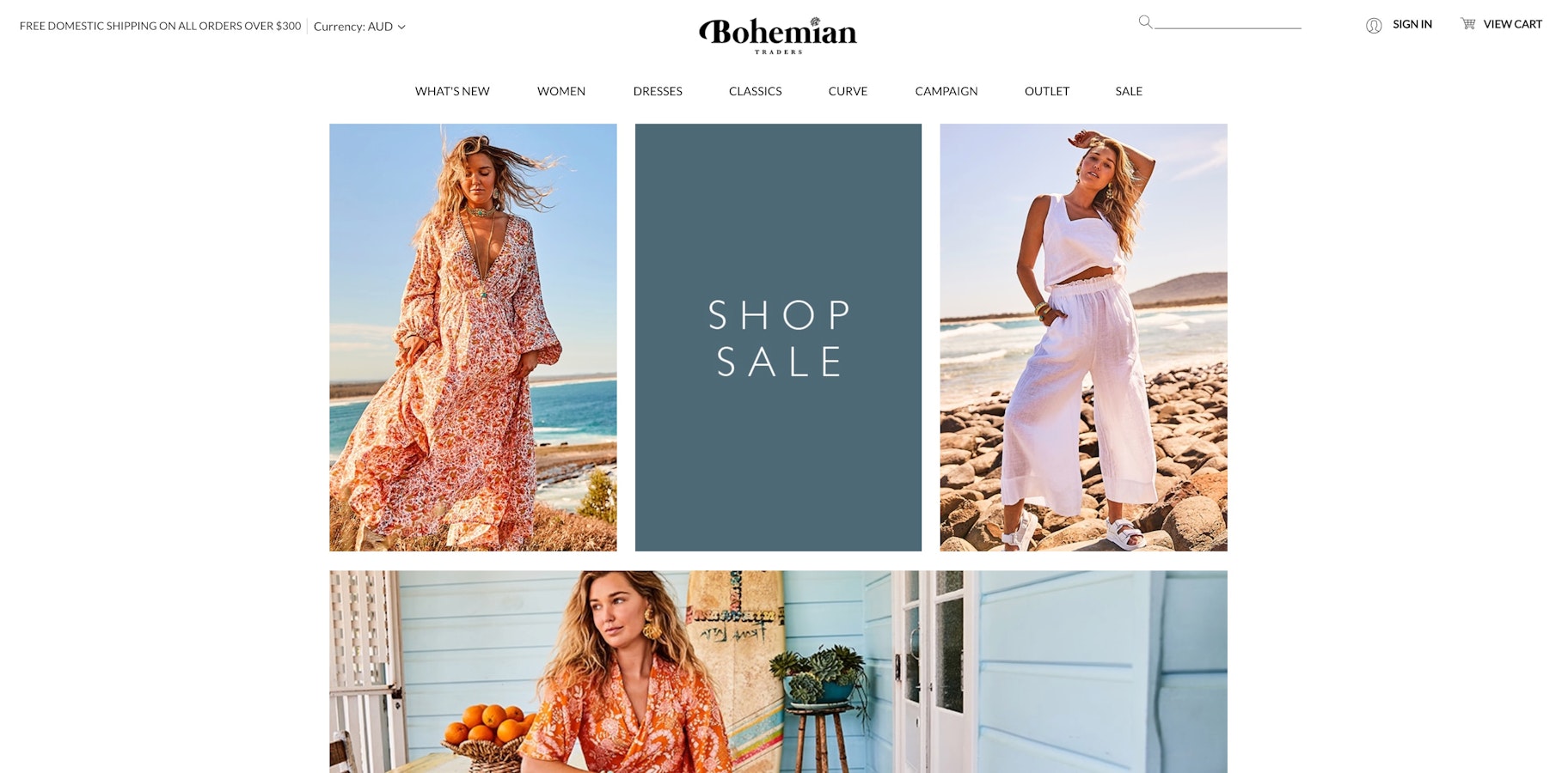
4. Bohemian Traders
If you’re looking for inspiration on how to design a clothing website, Bohemian Traders is a good place to start. With a bit of Bohemian touch to the website design, visitors to this ecommerce website can easily navigate between clothing items based on the latest arrivals, occasions, accessories, or sale items.
5. ambsn
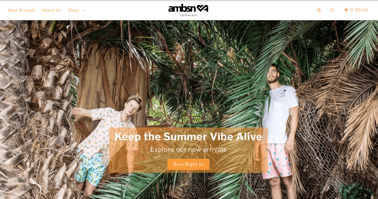
Here we have another ecommerce clothing website. There are a bunch of these on the list, actually. This particular store is full of colorful patterns on their jackets, shorts, and t-shirts. So it’s no surprise that their ecommerce website design is full of big bold colors too. They also use a lot of orange, which stands out against the minimalist background of the site.
6. RYDER
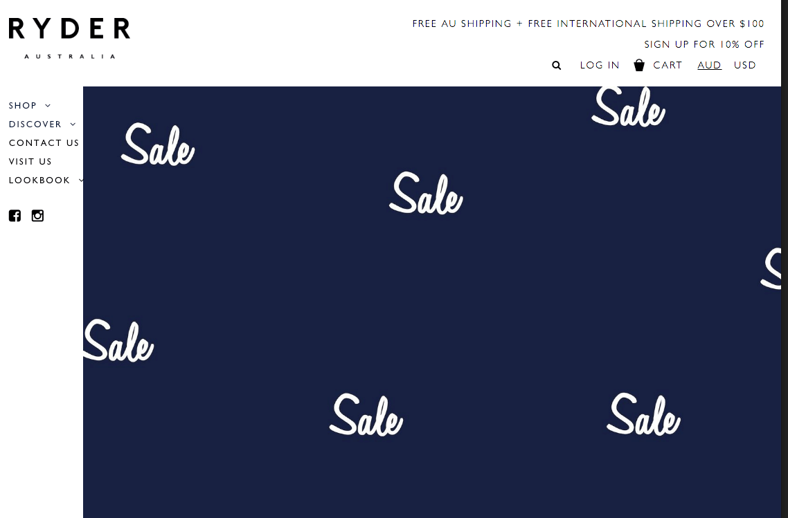
Ryder is on the list because of their strange (but interesting) take on ecommerce website design. Their homepage is not what most online stores look like. But that’s a good thing. Because their web design is creative. Creativity helps stores stand out. Doing something a little different can help your bottom line a lot.
7. POGG
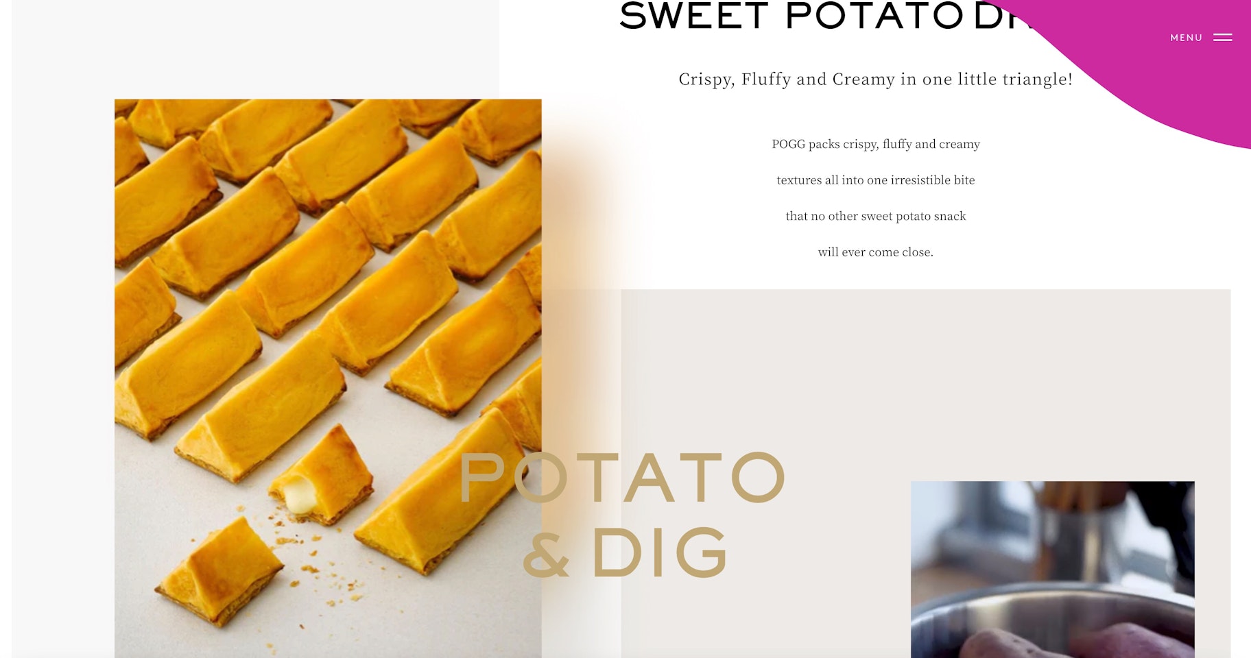
POGG, a sweet potato pie brand, does a great job at portraying the texture of its products on its ecommerce site. You can see an elegant white template spread through pink and gold palettes, which perfectly complements the high-quality product shots. The layout has a magazine-like structure with a delicate UI, with video clips nestled flawlessly inside the hovering blocks throughout the site.
8. Dick Moby
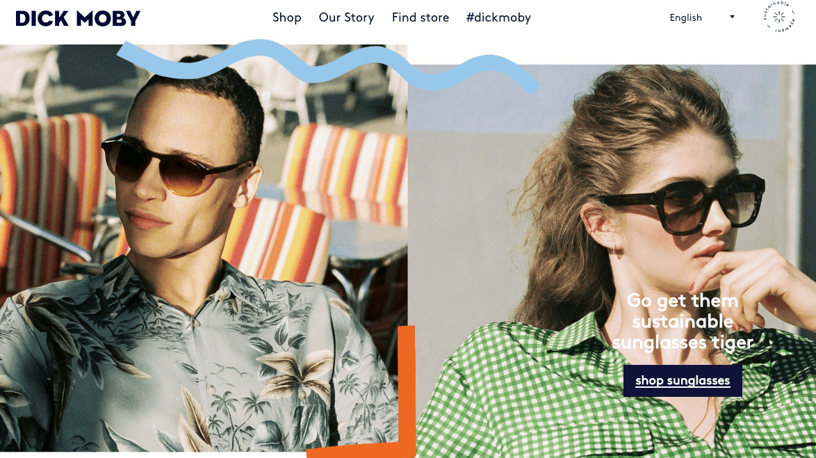
Dick Moby sells glasses. Their ecommerce website design is full of great design elements. First off, it’s the fun patterns and squiggles you see at the top of their home page. Second, it’s the quality photos of their glasses. Notice that on the shop page, the glasses are alone without anything in the background. That lets the product stand out. It’s a great ecommerce website example where the design helps create a unique feeling for the products.
9. The Horse
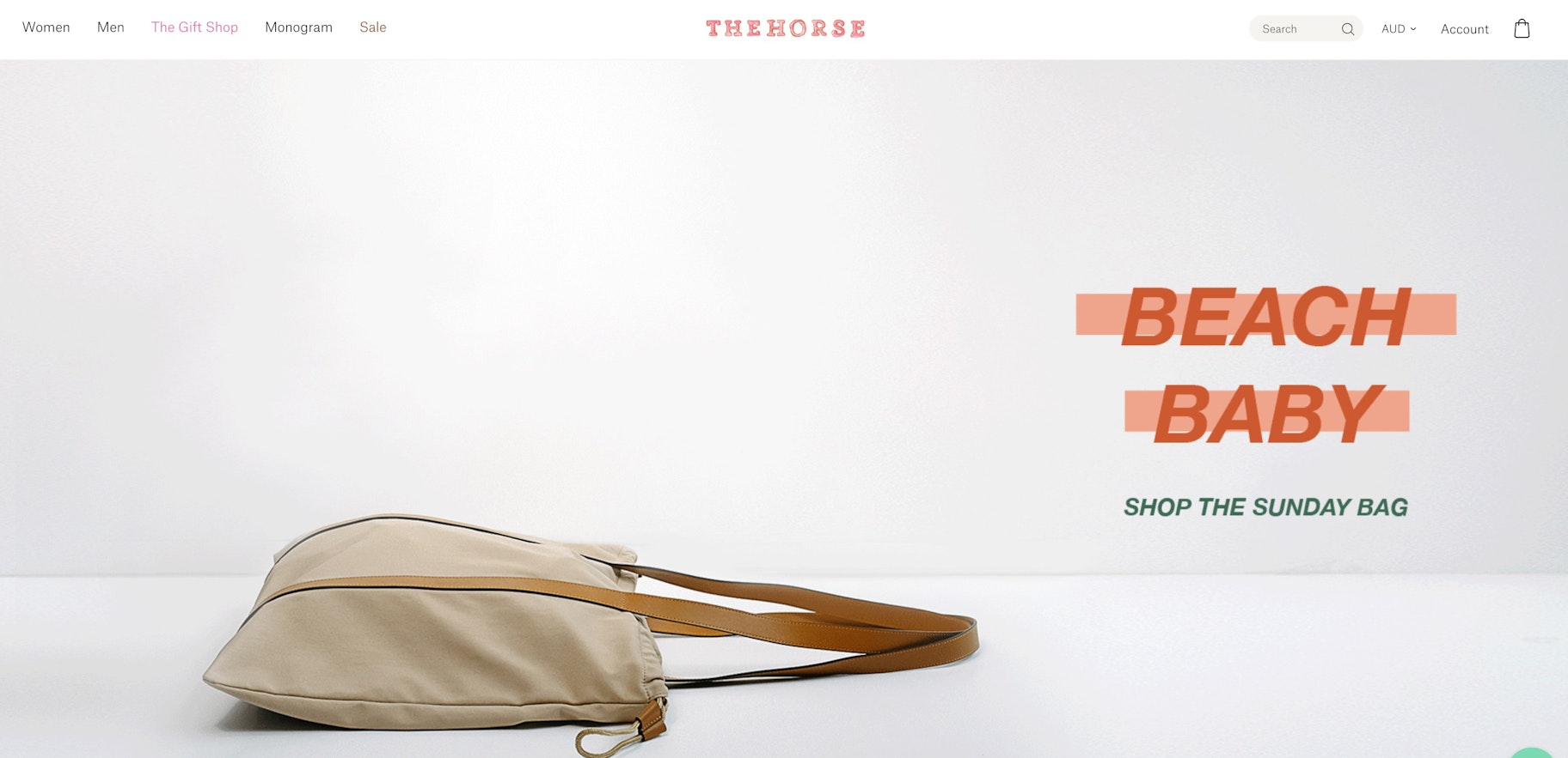
Everything starting from the name to the design of this ecommerce website is memorable. You see big bold pictures as part of their web design, with fewer words. If you’re looking for how to design a website in a unique way, you can definitely take some inspiration from The Horse’s amazing website design.
10. ESQIDO
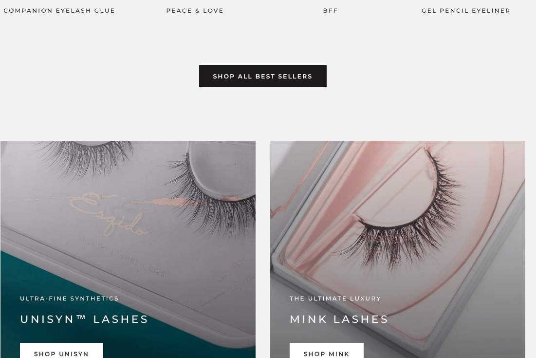
The ecommerce website design of ESQIDO focuses on the beauty of their main product- lashes. It’s full of close-up photos of the product and its intricate packaging. What’s more, they even have a short video on their homepage explaining how to apply fake lashes. This ecommerce website is especially helpful to go over if you’re looking for some ideas on photographing makeup or beauty products for your ecommerce website.
11. Mahabis
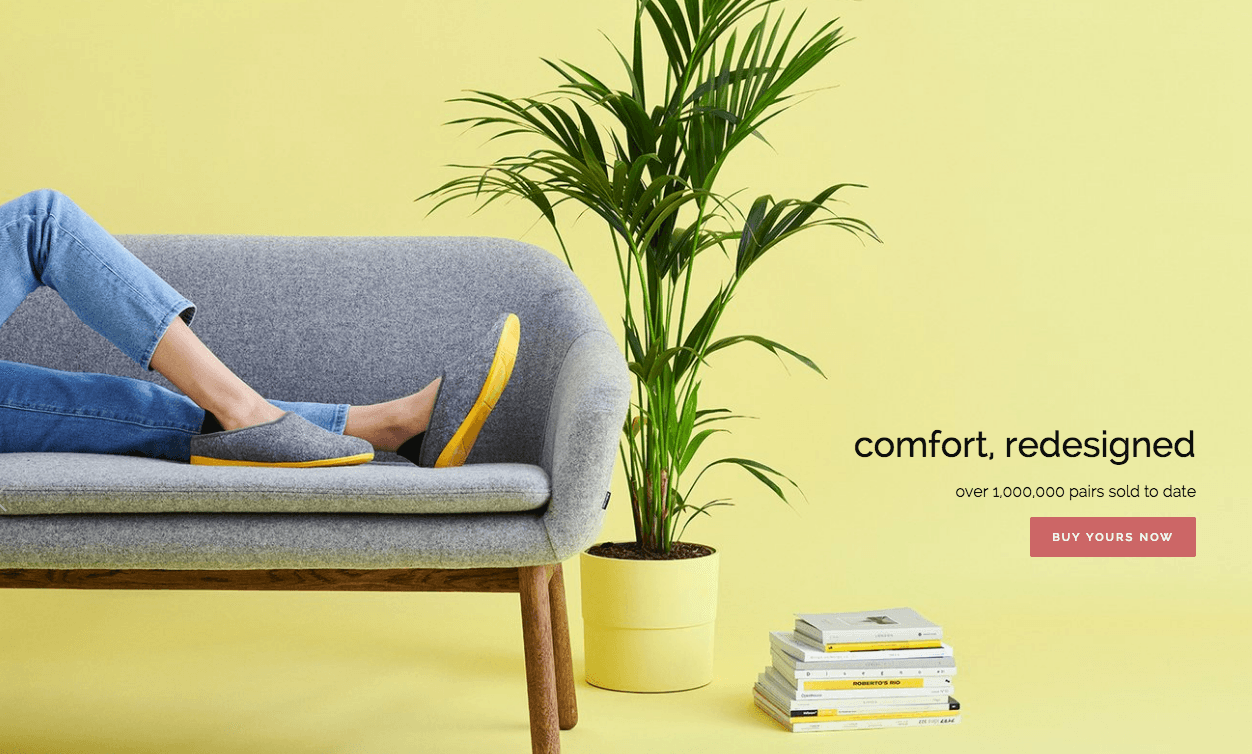
Mahabis focuses on showing off their high quality products straight away. And what better way to do that than with a beautiful website design. As soon as you’re on the homepage of this ecommerce website, you’re greeted with a one line description of how comfortable their product is. The amazing design of this website shows even the smallest of details to entice the potential buyer.
12. Poketo
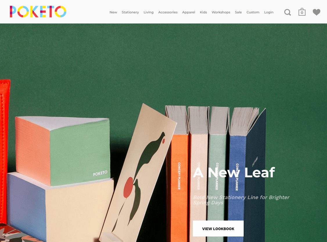
Poketo uses vibrant colors to their advantage. You can easily navigate through their product options since they’ve got them lined up at the top. Or, simply scroll down and treat your eyes with their boxy patterns. The white font makes it easy to read the text and call-to-actions, and the site owner smartly uses a black font on the negative space to make reading easy for visitors.
13. Jackie Smith
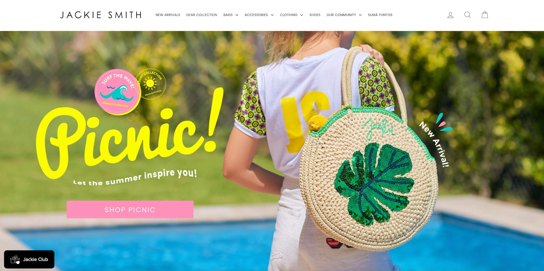
Jackie Smith is another example of ecommerce website design that uses bright colours to its advantage. But the colours aren’t just limited to photos of their colourful bags and promotions. Even the fonts that they use are colorful!
14. Grovemade
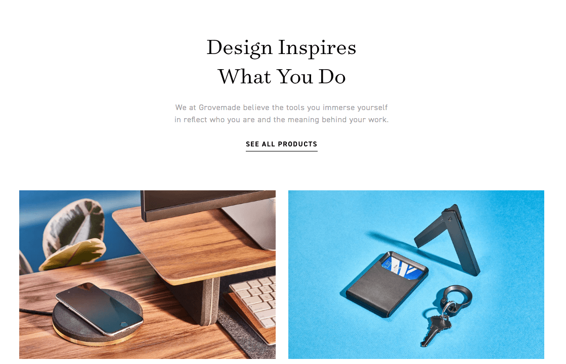
Grovemade relies heavily on lifestyle shots of their products. They’ve included beautiful photos of their wooden accessories on desks and tables. The composition of the photos is great. Did you notice their fun font too? It’s rounded, which isn’t the typical font you see on most website design templates.
15. Muroexe
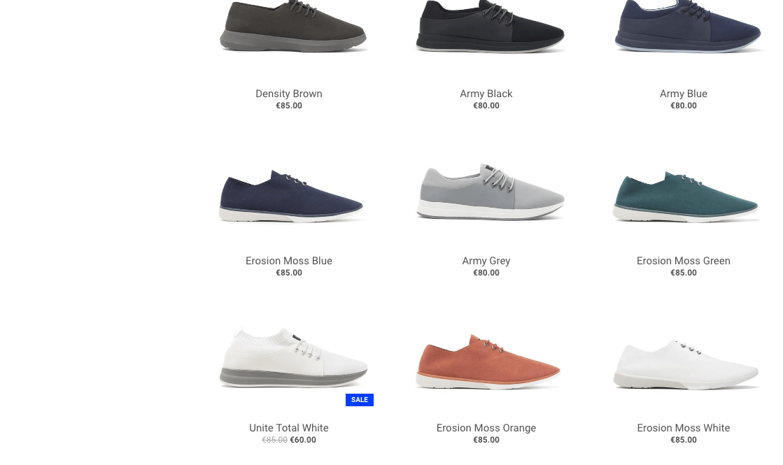
The layout of shoe products on Muroexe is great. The shoes are aligned in a neat grid, making browsing easy. There’s a lot of whitespace, which is the empty space or padding around the photos, making the products on this ecommerce website stand out even further.
 16. Sierra Designs
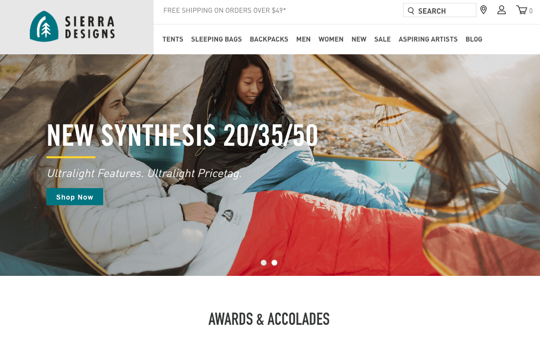
Sierra Designs is a great example of website design to take inspiration from. Their eye-catching professional photography and user-friendly website provide an equal balance between a clean aesthetic and a responsive design. The website has a feeling of adventure and liveliness that’s through the appealing photos on this ecommerce store.
 17. Helbak
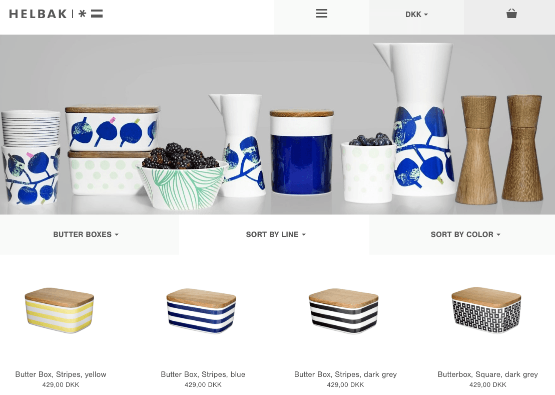
Helbak is the perfect example of small business website design that shows that you don’t have to overdo it. Their products are beautiful and clean. The design utilizes the color of the products and white space in the background to show off the artistic side of the items. It’s simple, it’s neat, and it’s easy to look at.
18. Molly Jogger
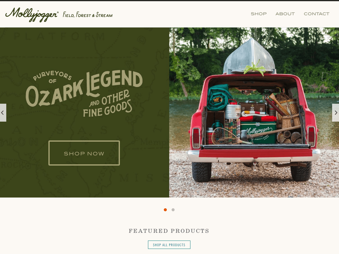
The thing about Molly Jogger’s website is simplicity. There’s nothing fancy going on here. But the great website design makes the products easy to browse and easy to digest.
19. Skullcandy
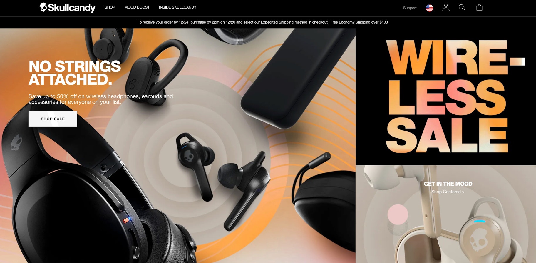
I’d call the ecommerce website design of Skullcandy anything but simple. Their website comes to life with their colors. They use just the right amount of text and visuals to enhance the experience for the visitors.
20. RSVP
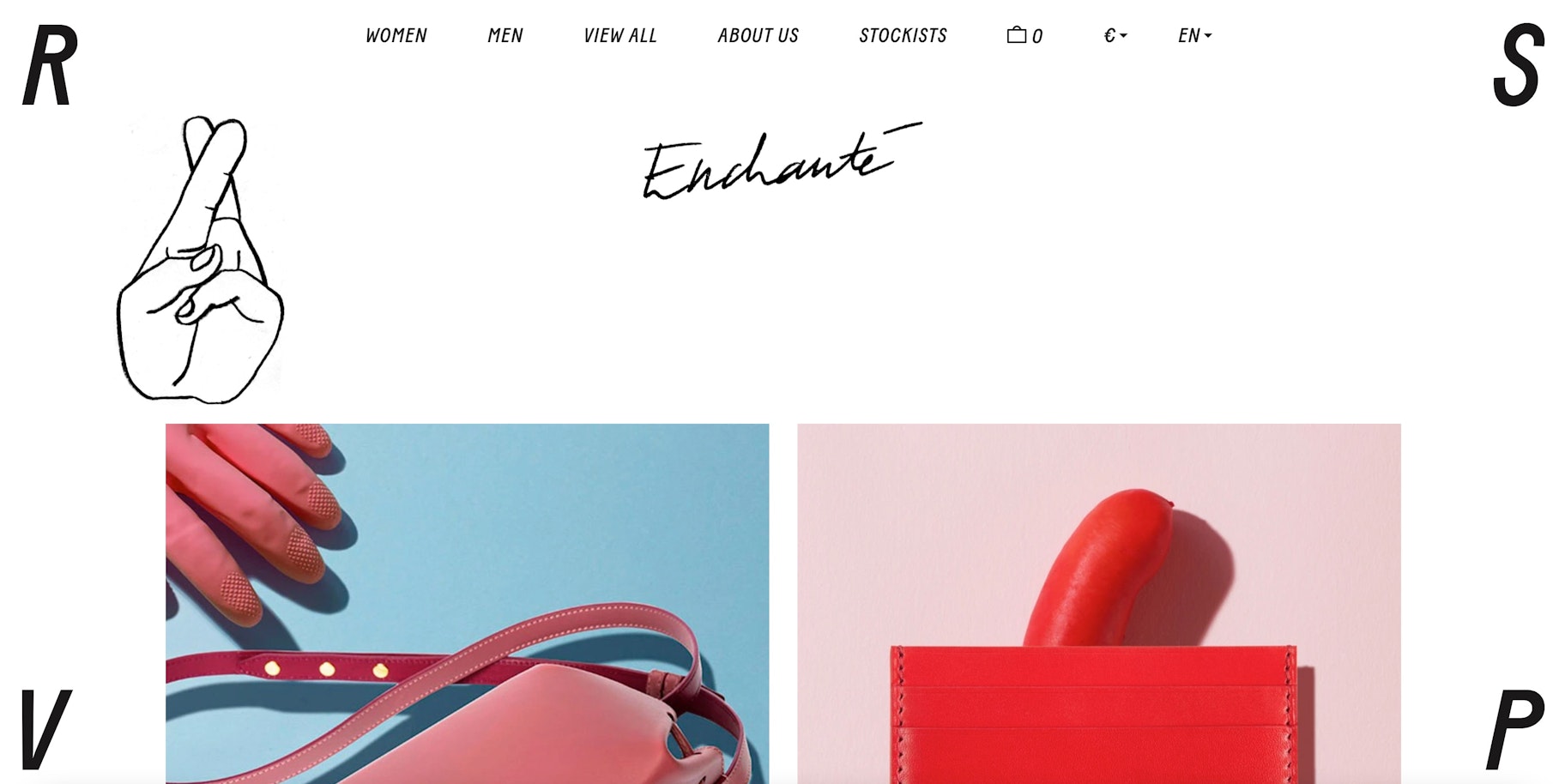
This ecommerce website design is interesting. A lot is going on at every corner of the web page. Literally. But it’s part of the experience of the company.
21. Ratio
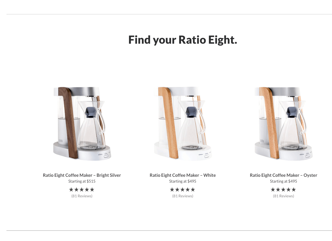
Ratio is using ecommerce website design to show their customers that they are selling a high-end product. Their coffee products have their own pages explaining their brilliance. The ecommerce website design is filled with good use of photography, color, typography, and just the right amount of whitespace.
 22. Frank Body
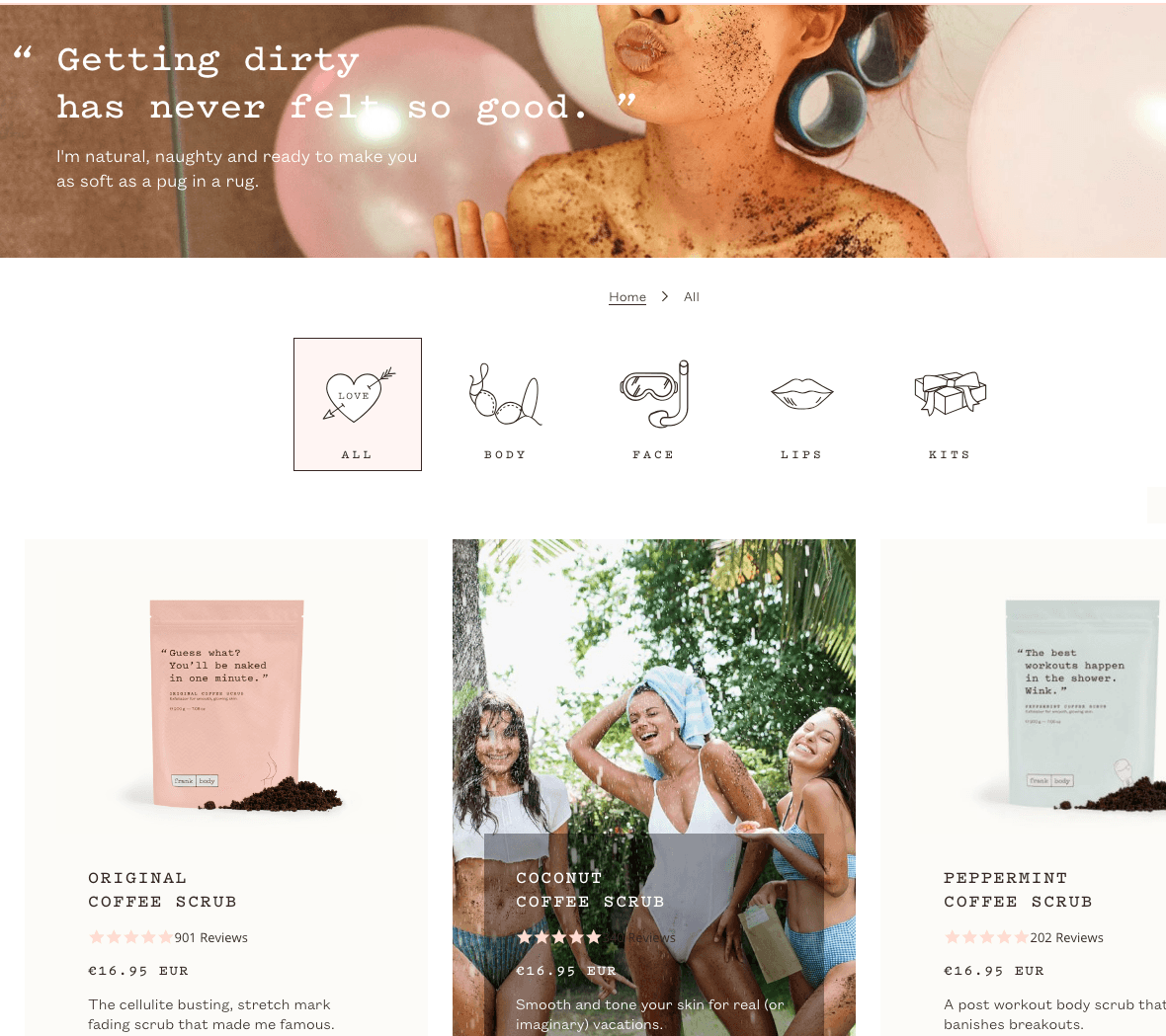
Frank Body is all about modern beauty. Their ecommerce website design caters to a fun and young audience. You can see this through their use of a monotype font and pastel colors.
23. Rest.
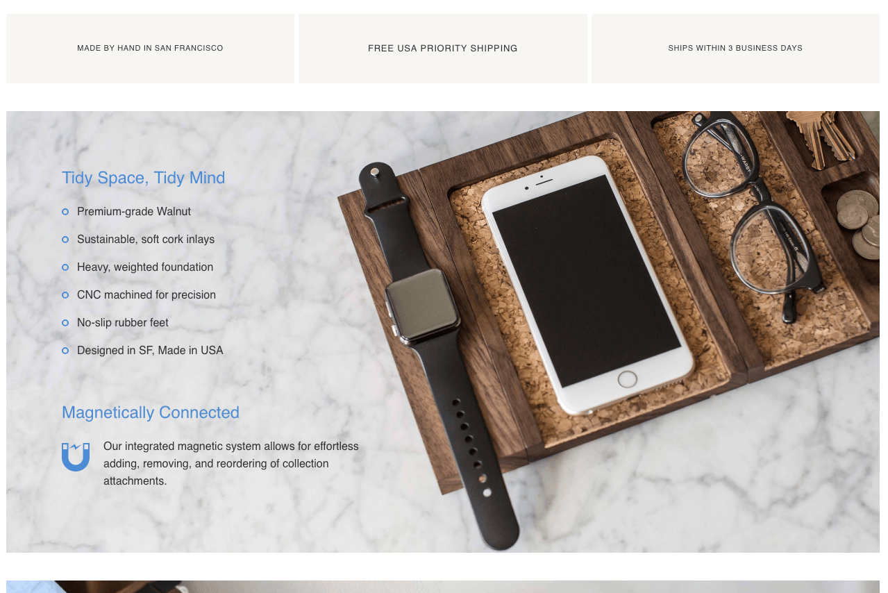
Rest sells wooden desk accessories. They are handcrafted and stunning. Naturally, the ecommerce website design for Rest is based on lifestyle shots of their products on desks. The product pages include well-designed details of the product and how great it would look if you bought all three. This ecommerce website has videos to watch on the homepage describing their products and brand bettera.
24. The Letter J
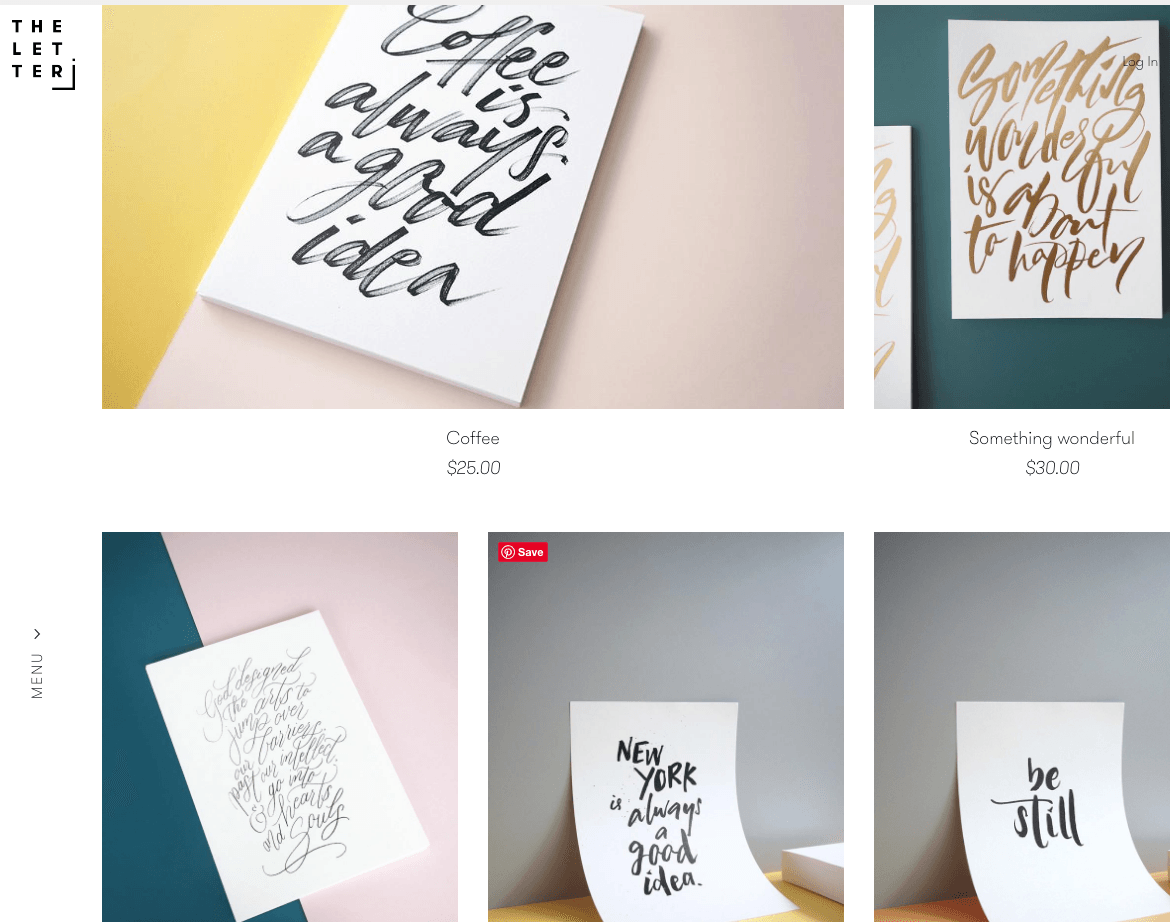
This ecommerce store example is one which sells typographical products such as prints and iPhone cases. They have a unique take on photos of their products. The prints are leaning against different colored pieces of paper. It’s different therefore interesting.
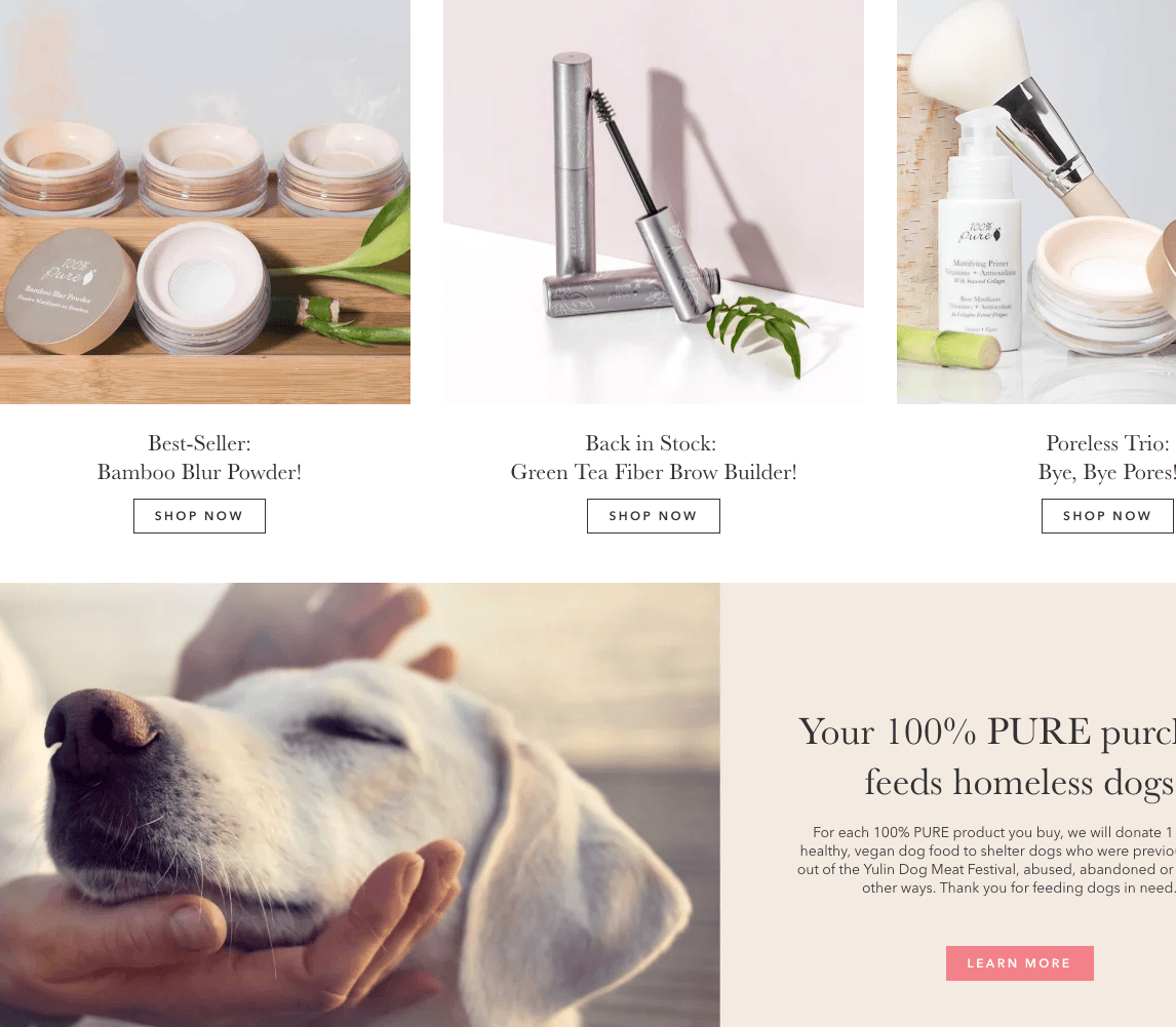
25. 100% Pure
100% Pure doesn’t have a fancy website. I wanted to include a less dramatic ecommerce website design example to show you that you don’t need to be overly creative to have a good looking website. It’s okay to start simply as long as your website is easy to navigate – just like 100% Pure.
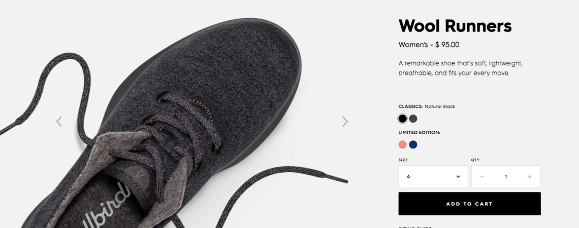
26. All Birds
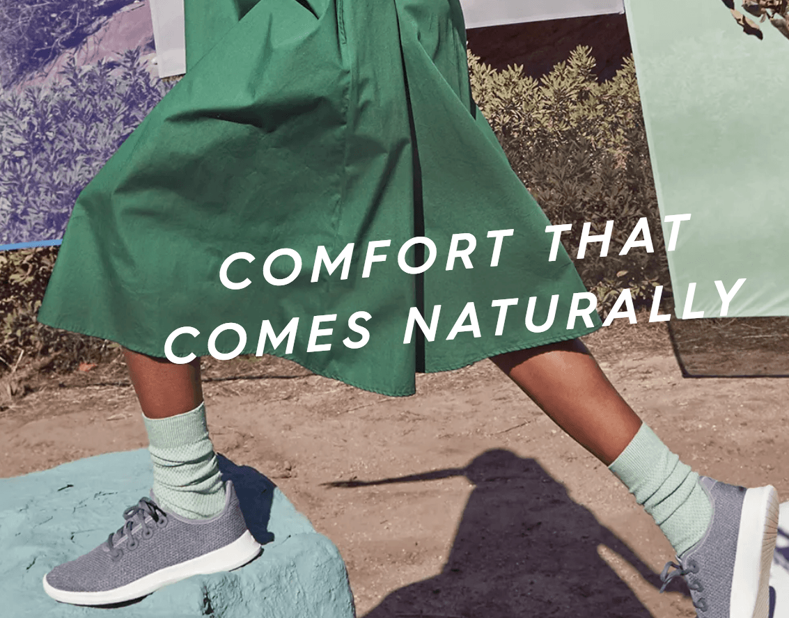
The thing I like about All Birds is the action shots of their shoes. It’s so much different than most shoe photos you see. Here they can be seen in pictures that give a feeling of motion. It’s different. It’s nice. It’s really memorable, actually.
27. Oi Polloi
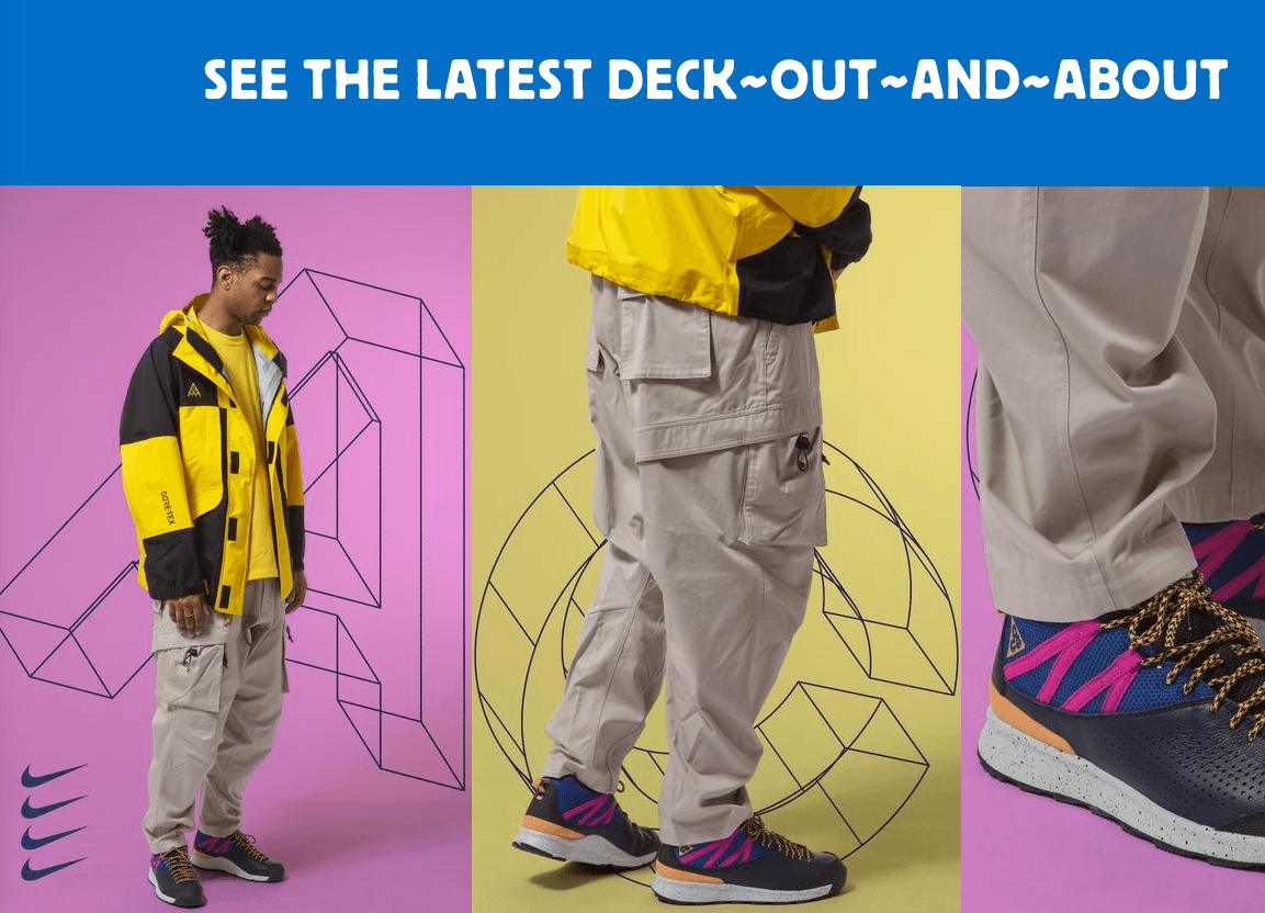
Oi Polloi is another one of my favorites from this list. Their homepage is minimal, but it’s also fun. And they show that minimal doesn’t need to mean cold. The website design of this ecommerce store relies on giant photos of their products on a colored background. They also use a fun custom font face to tie it all together.
28. P&Co
The reason P&Co is on this list is their attention to product detail. This clothing website’s design is undeniably very particular. They show off so many different angles of their t-shirts. They have a lot of different specs for the item too. That is just as important as having a great ecommerce website design.
29. Black Butterfly
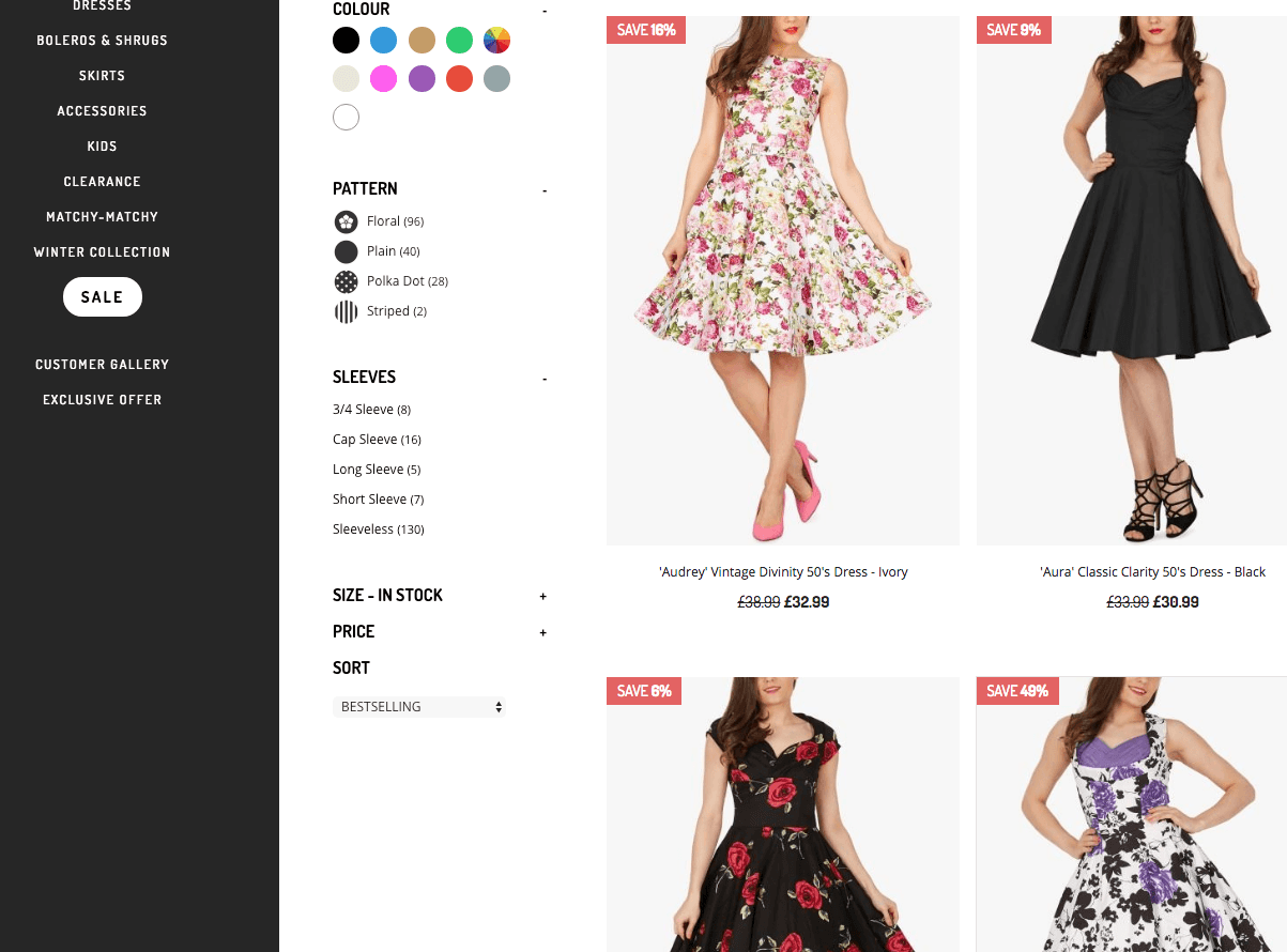
Black Butterfly’s web design aims to represent a simplistic, modern feel with a basic theme. This ecommerce website example is one that follows an easy structure. With fun photos and cute graphics covering the website, you can easily scroll through to the dress category that you’re interested in.
30. Di Bruno
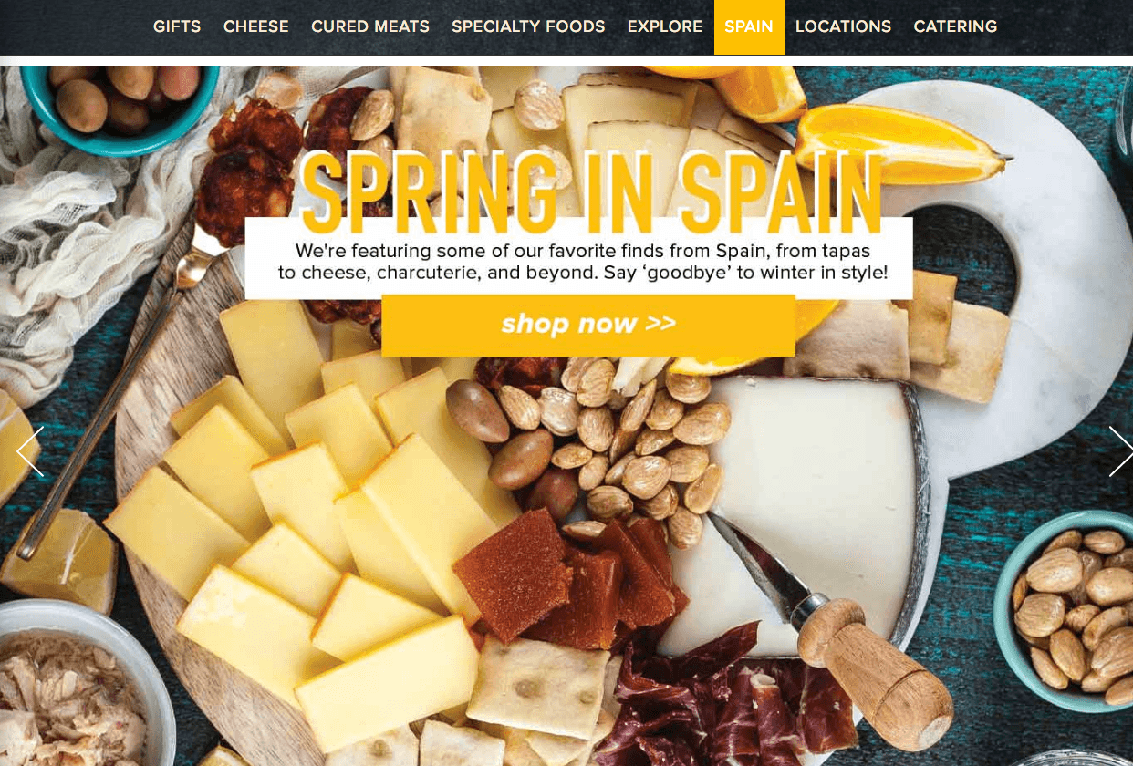
When you first enter the Di Bruno site, it’s hard to ignore the design of this ecommerce website. One of the highlights of this website’s design is that they have short descriptions of each of the products, which visitors can read when viewing product category pages. So, for instance, if you’re interested in trying something new, you can browse through the product pages based on images and then get a short preview of the food product you would like to know more about. This helps people discover what they might like and provides an in-store experience for the user.
31. SISU Guard
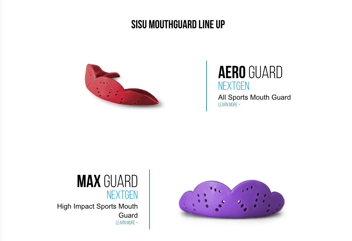
SISU Guard has one of the best-designed ecommerce websites when it comes to Sports. Their website is categorized into sections to make it easier for visitors to skim through their categories of interest. The minimalist design helps keep the focus on the product.
 32. Dainty Jewell’s
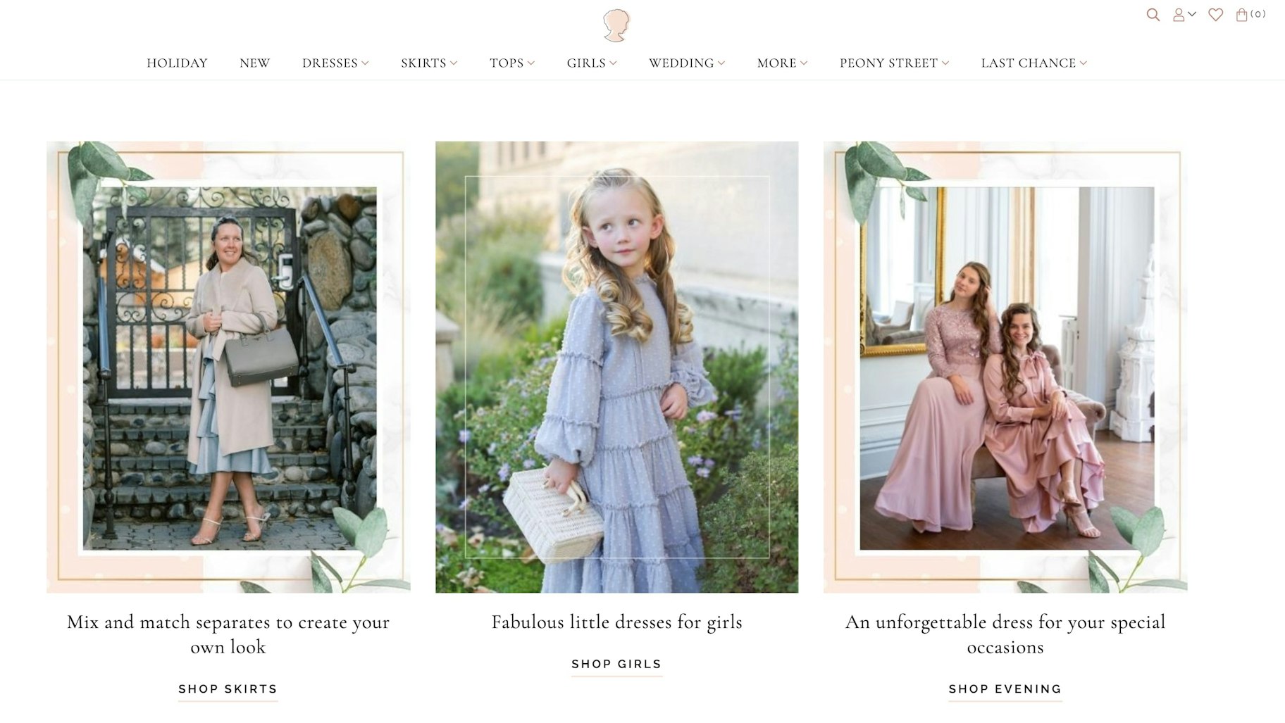
This is an example of a clothing ecommerce store with a very soft vintage look. The main colors you’ll see here are light pink, gold, and white, accompanied by delicate patterns. This ecommerce design goes well with the product that they’re aiming to sell. It feels very feminine and fresh, with the font matching the rest of the website’s look.
33. Boxhill
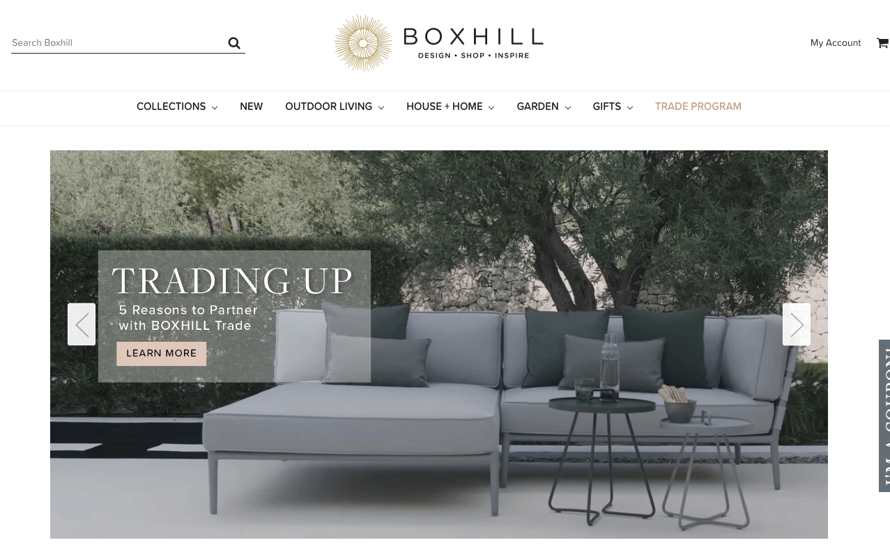
This beautifully designed ecommerce store has a theme with a lot of white space, which helps present the items more prominently. It has a very neat and clean design, making the website look very professional and sophisticated. The items are listed simplistically, but when an item is clicked on, it is accompanied by a lengthy description for those interested in knowing more about the product.
 34. Northernism
The unique aspect of this ecommerce store is that it stands out by placing images and text on a grid, which isn’t done by many other ecommerce stores. With a modern design, this ecommerce website has plenty of free white space, containing simple images, making it feel much less crowded.

35. Bon Bon Bon
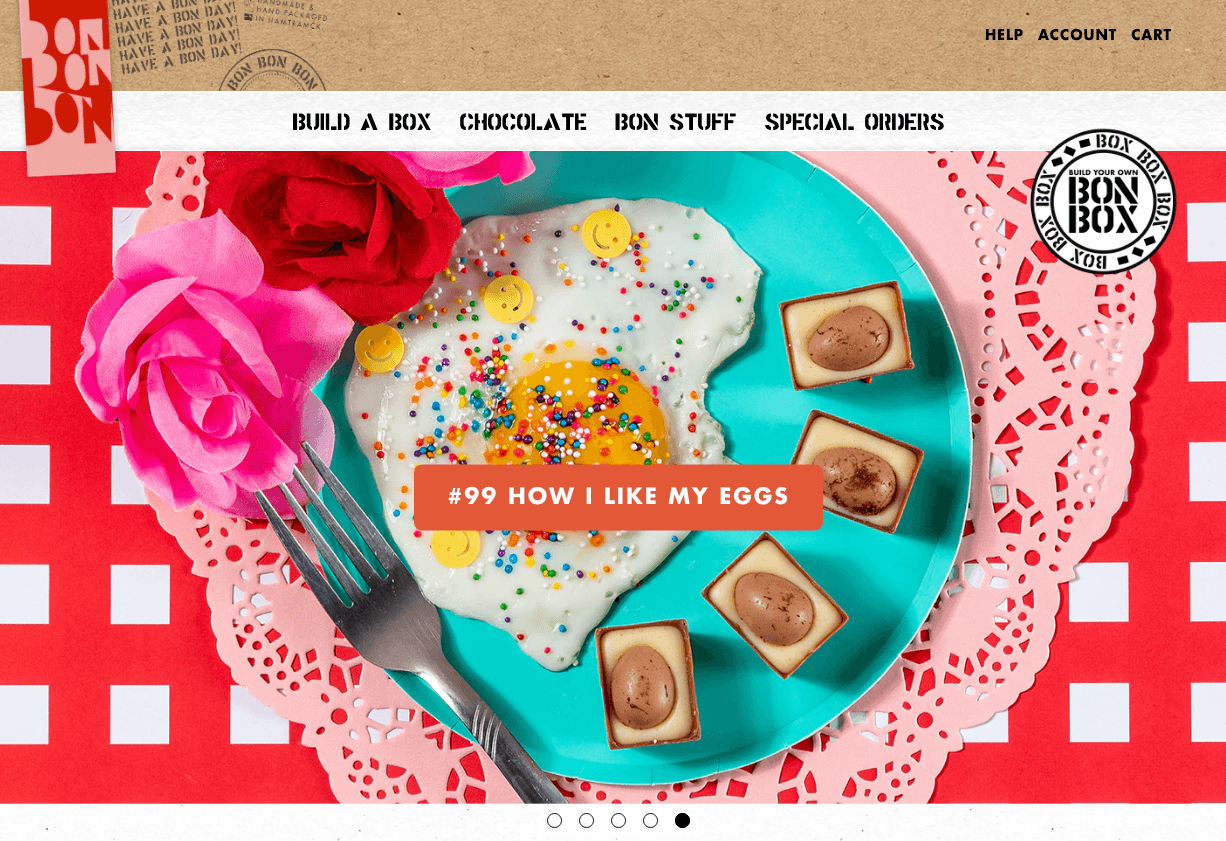
Bon Bon Bon is an artisan chocolate company with a truly impressive website design. There’s a lot going on here, and it all reflects fun. They’ve got colors, designs, patterns, and lots of different shapes. Even their add to cart page looks unique and fun!
 36. Simply Chocolate
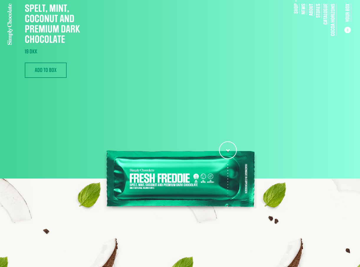
Simply chocolate is a chocolate company based in Copenhagen, Denmark. The design of this ecommerce store gives enough space to let each of their products shine individually. When you scroll down the page, a new chocolate bar floats up in the middle of the page, with each chocolate bar taking a different color theme and a fun name. Additionally, each bar’s ingredients, such as coconut slices, almonds, mint leaves, or others, cover half of the screen animatedly. The website design of this ecommerce store is one that can’t be compared to any other.
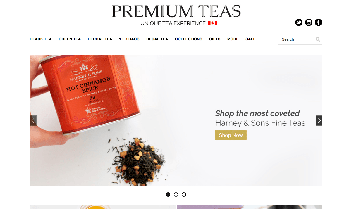
37. Premium Teas
This ecommerce store has a clean, modern, and sophisticated design. The teas are presented in a way that makes it easier for visitors to scroll through and select their desired product. The page focuses on visual representation rather than being covered in too much text. When you click on any product, you’re taken to a different page that has a detailed description of the tea. This includes product information like aroma, caffeine level, brewing time, brewing temperature, and much more information that can be valuable for the buyer.
38. Bouguessa
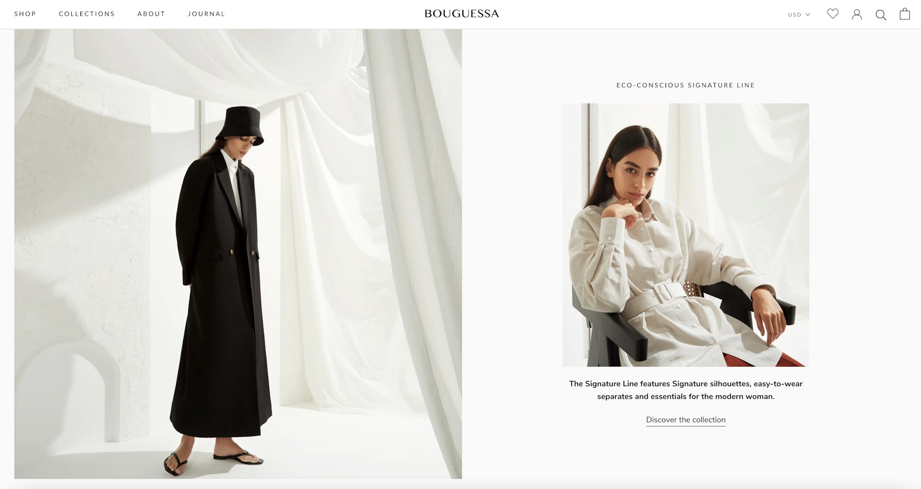
Bouguessa’s homepage gives off a luxurious feel as soon as you arrive on the website. The ready-to-wear fashion brand allows images to take center stage, relying on them to sell the items while keeping navigation to a minimum. The black and white theme also enables long dresses and bright colored apparel to stand out amongst other elements. Also, we love the smartly placed Instagram feed above the footer section – it gives visitors a chance to envision the product on real people.
39. Ban.do
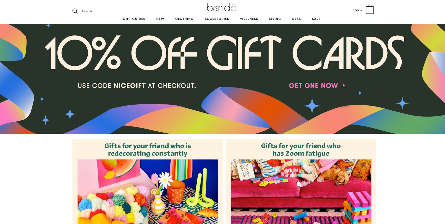
ban.do is a lifestyle ecommerce store featuring a playful and intuitive theme with a touch of vibrant colors. This combination gives it a youthful spirit, while the easy-to-use navigation makes it difficult to exit the site. The online store balances design and imagery by including high-quality product shots on its homepage.
40. THE PARFAIT STAND
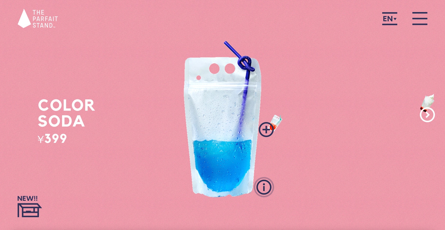
This Tokyo-based ecommerce site switches from a flat theme to a unique dimensional affair using suggestive motions. There’s also hyper-stylized visuals of the product and the shop full-screen animations that switch to modal views when you hover over them. It’s fun yet inspiring to watch. We especially love the animated green text-slider above the footer that contradicts the static with the dynamic.
FAQs About eCommerce Website Design
- How do I design an ecommerce website?
With Shopify, you can select from a number of pre-designed themes and customize the look, or build your own theme if you have web design experience. Check out the top ecommerce website designs to find out the key elements you should consider when designing your online store.
- How much does it cost to use Shopify for your ecommerce business?
Try Shopify free for 14 days, then choose from a range of plans that suit your business needs. Check out Shopify to learn more about starting your ecommerce business with them today.
Do you have a favorite website with a great design that we didn’t include in this article? Let us know in the comments below!
Want to Learn More?
- 60 Most Inspiring and Successful Shopify Stores
- How to Create a Website: 5 Ways to Create a Website
- The Ultimate Guide to Mobile Commerce
- How I launched my ecommerce store in less than 30 minutes (with products)

